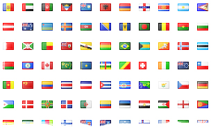
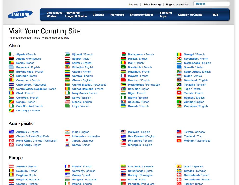
 When launching a multilingual site, oftentimes the navigational system of language and country is left to the end, with publishers just slapping on a flag icon to denote language. But in most cases, the use of flags is not the most effective way to express language choice.
One reason is that many countries have more than one official or national language. Here’s just a short list:
- Afghanistan: Pashto, Dari, Uzbek and five more
- Belguim: Dutch, French, German
- Cameroon: English, French
- South Africa: Afrikaans, English, Southern Ndebele and eight more
- Spain: Spanish, Catalan, Galician, Basque, Asturian, Occitan
- Switzerland: German, French, Italian, Romanish
Would a flag represent all the languages contained within a specific country, particularly if different regions of a country do not identify with the national flag for political reasons?
Another more obvious reason that a flag is not an effective icon is that languages cross borders and can represent many countries. Using a flag from Spain to represent Spanish does not necessarily identify with Latin American countries. A user in Mexico would certainly select the Spanish icon to reach a Spanish language site, but they would most likely feel alienated by the choice.
Similarly, should the American or British flag be used to represent the English language? Does it really represent the rest of the English-speaking world? How about the French flag for French: what about Canada, Côte d’Ivoire, Switzerland and other countries where French is also spoken?
In their internationalization best practices, the World Wide Web Consortium (W3C) quite simply states that flag icons should not be used to indicate languages because flags represent countries, not languages. To sum up, numerous countries use the same language as another country, and numerous countries have more than one official language.
Creating a usable navigation system for languages and countries
Let’s put aside the use of flags for a while, and first focus on creating a meaningful strategy on the first navigational choice a user will make upon entering your site. You have to look at it in terms of levels and context. Each site will have a different system that works for them.
First, you have to decide whether it makes more sense as a first cut to divide by language or country. How do you decide this?
Does your site have a presence in specific countries, with tangible product distribution and a bricks and mortar presence?
Then country-selection should be the first tier, as users will most likely need to purchase or contact from within their own country. Typically this works well for corporations and vendors.
But if you are a non-profit or university or provide a service that can cross geographical borders, you should consider language as your first-tier navigational level. For example, Amnesty International reaches out on an international level to promote awareness and appeal for donations. Visibility in several key languages is crucial to their success, such that a user would more identify with language rather than country.
Now that our first tier is established, what would be the second tier? For some sites, the first tier might be sufficient. But most often, a site might require an additional architectural layer to provide language options for a country with more than one official language or to promote programs and headquarters in specific countries and regions. Fig. 1 and Fig. 2 show two schemas.


Country then Language
There are many examples of sites organized by country first. On any typical corporate site these days a user first locates the country, and then within that region, selects the available languages.
This can be done from the header or footer in a pull-down menu [see Fig. 3] or via a gateway page with all the options available [see Fig. 4 and Fig. 5]. With the growth of languages being added to sites year over year, a pull-down menu becomes more unwieldy. John Yunker, author of “The Art of the Global Gateway” advocates for the use of the gateway page in which the user can more easily see all the options at a glance. Note that the best practice is to present the language options in the spelling of the original language, not in the language of the host site.


Language then Country
The Unicef site (Fig. 6) provides a good example for how a navigational system by language first then country works. They provide information about their organization in English, French, Spanish, Arabic and Chinese. Since they have regional programs, they created a tab “Info by Country” for users to easily find information by country in the language chosen (Fig. 7). For regions where they have an active presence, they have created mini-sites or subportals, such as Latin America and Caribbean, in which the language switches to Spanish since it is localized for the region (Fig. 8).


So, when would you use a flag?
Although flags are still widely used, most localization experts agree that they should be discarded. John Yunker suggests instead the use of an icon of the world next to the language options to bring attention to where someone might be able to change to their country or language options.
More and more sites these days are opting for intelligence-based systems that detect the country and language of the IP address to direct the customer directly to that site. However, the user should always be given some way to navigate to other languages or countries via a link to a gateway page or a pull-down menu.
The use of flag icons must represent a well-defined strategy that is sensitive to cultural identity and context. If such a system must be used, following a sample as the Philips site shown in Fig. 3 may be the most appropriate if the site promotes country-specific programs on the first level followed by a list of appropriate language options.

5 Comments